

Arly Brand Identity
The Catalyst: Arly is a youth program management tool that needed a rebrand—something that would breathe life, energy, and a distinct personality into a sterile tech landscape. The goal was to build a brand that truly represented youth, curiosity, and exploration.
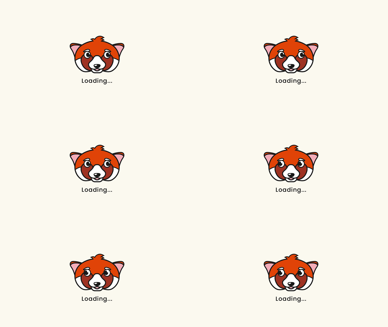
To achieve this, the project required an entirely new name and a memorable mascot. After exploring the animal kingdom for a figure that embodied adventure, Arly was named, and a spirited little red panda was born. Arly’s character feels inherently curious and unique, featuring sharp, dark illustrative outlines that perfectly mirror the linework used across the broader visual system.
The Strategy: The final visual identity draws deep inspiration from youth camps and outdoor exploration. Custom trail lines curve through the primary wordmark logo and across brand collateral, metaphorically guiding the viewer through a journey. This adventurous theme is further reinforced by subtle, map-like topographic patterns and a vibrant color palette rooted in the nostalgia of summer camps. The result is a cohesive, playful identity that bridges functional software with the magic of childhood discovery.




Copywriter: Kathleen Goodwin
Agency: Manifesto