Pinnacle Companies Visual System &
Brand Applications
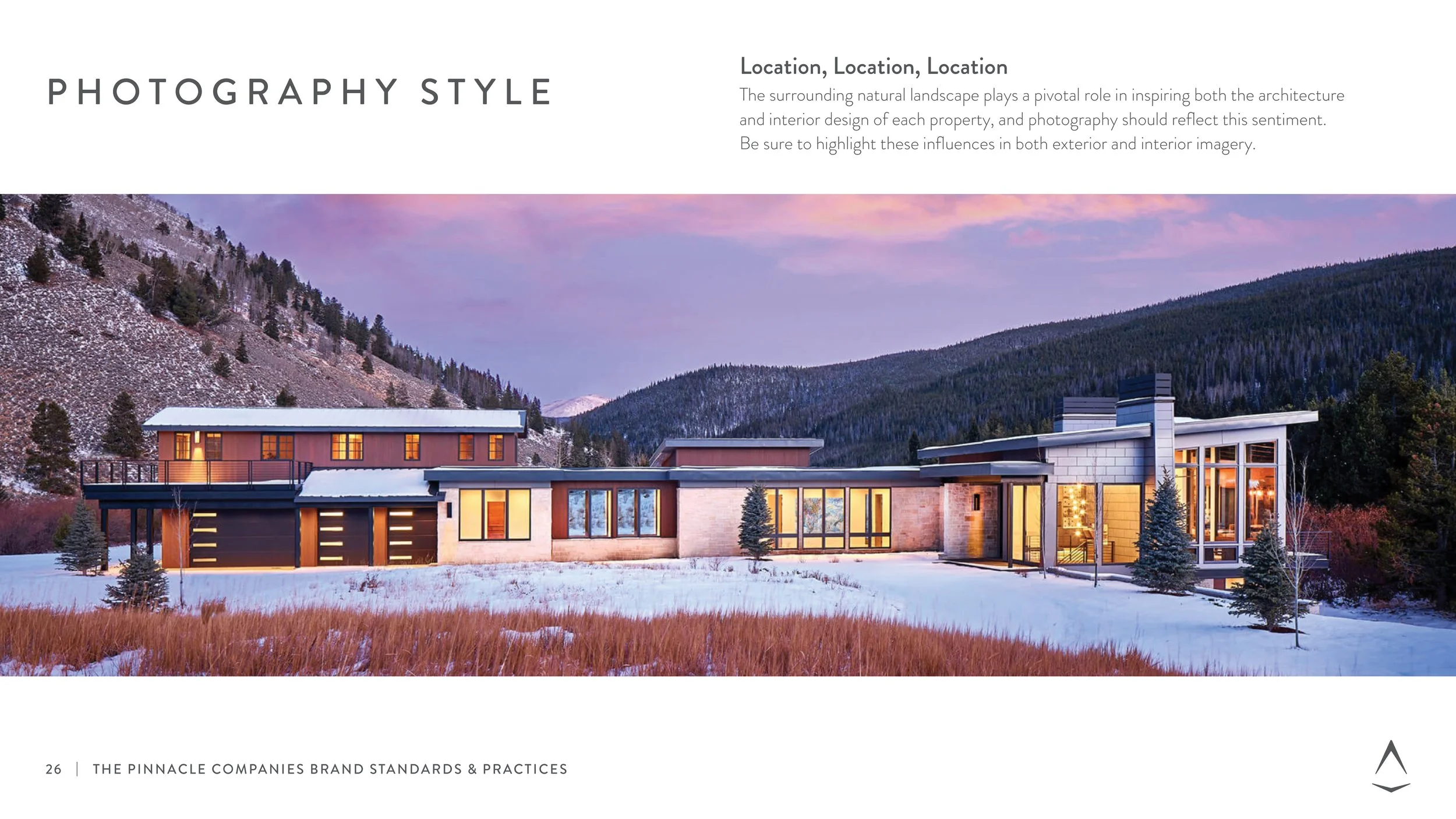
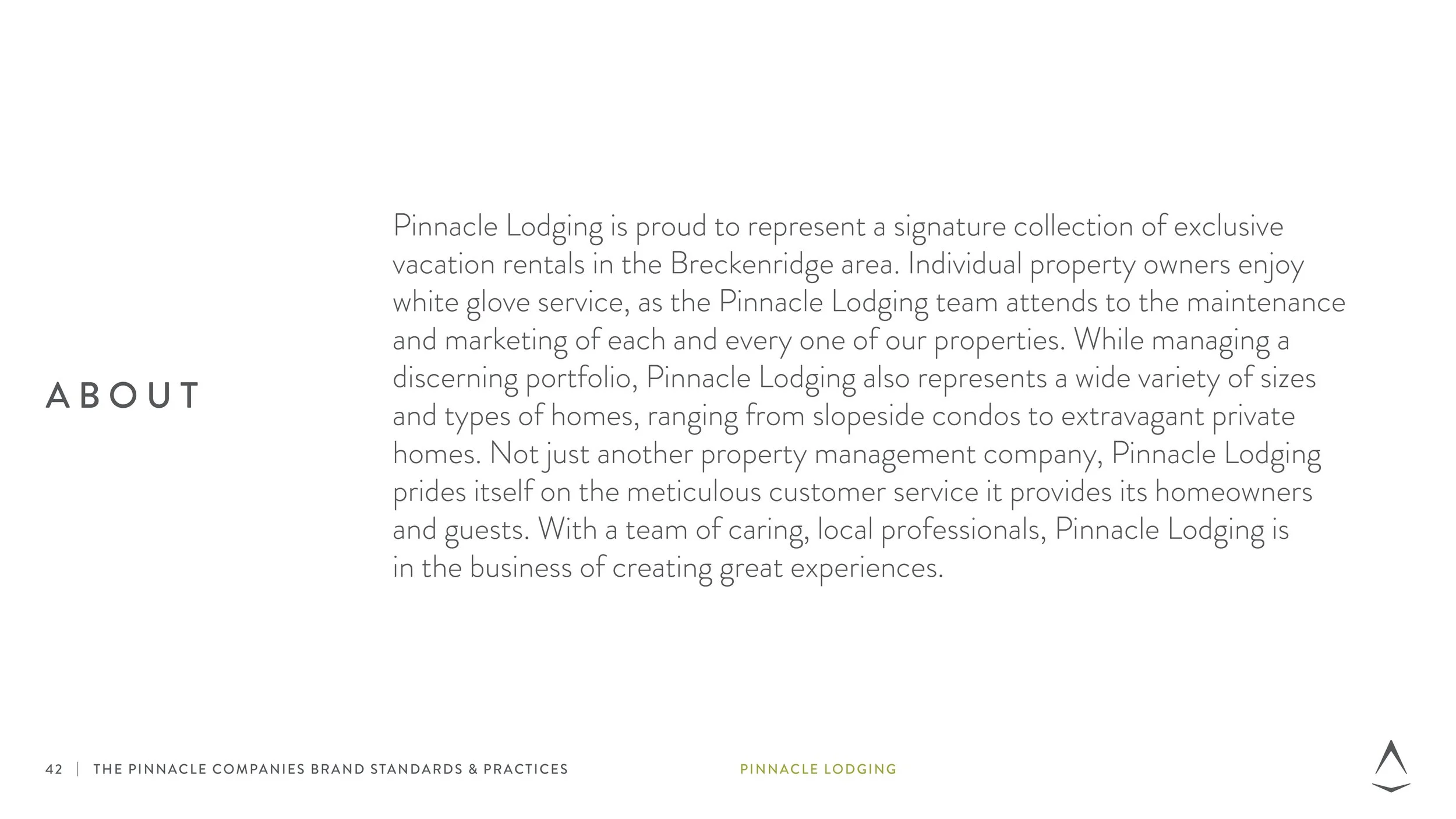
The Catalyst: Driven by a unique culture of striving to achieve a "Pinnacle life," Pinnacle Companies operates on a continuous desire to grow, evolve, and improve. As a parent brand, it oversees a collection of sub-brands that touch every step of designing, building, and living in a home: Pinnacle Mountain Homes (luxury home construction), Pinnacle Lodging (luxury vacation rental management in Breckenridge, CO), and Collective Design (architecture and interior design). While the organization possessed a strong, existing compass logo mark, they lacked a unified visual identity system. They needed comprehensive guidelines to anchor the parent brand alongside its sub-brands, using innovative and creative applications to engage audiences in unique ways.
The Strategy: To build a cohesive, multi-brand ecosystem, a flexible and expansive design system was developed:
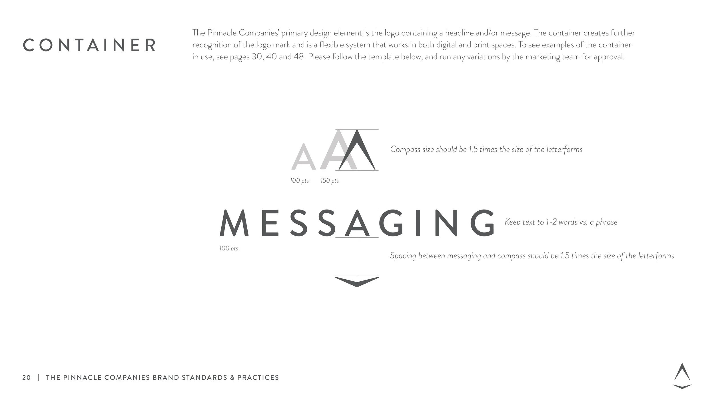
The Container Framework: Developing "the container," which beautifully integrates the compass logo with headlines or specific messaging. This system drives instant brand recognition and scales seamlessly across digital layouts and print spaces.
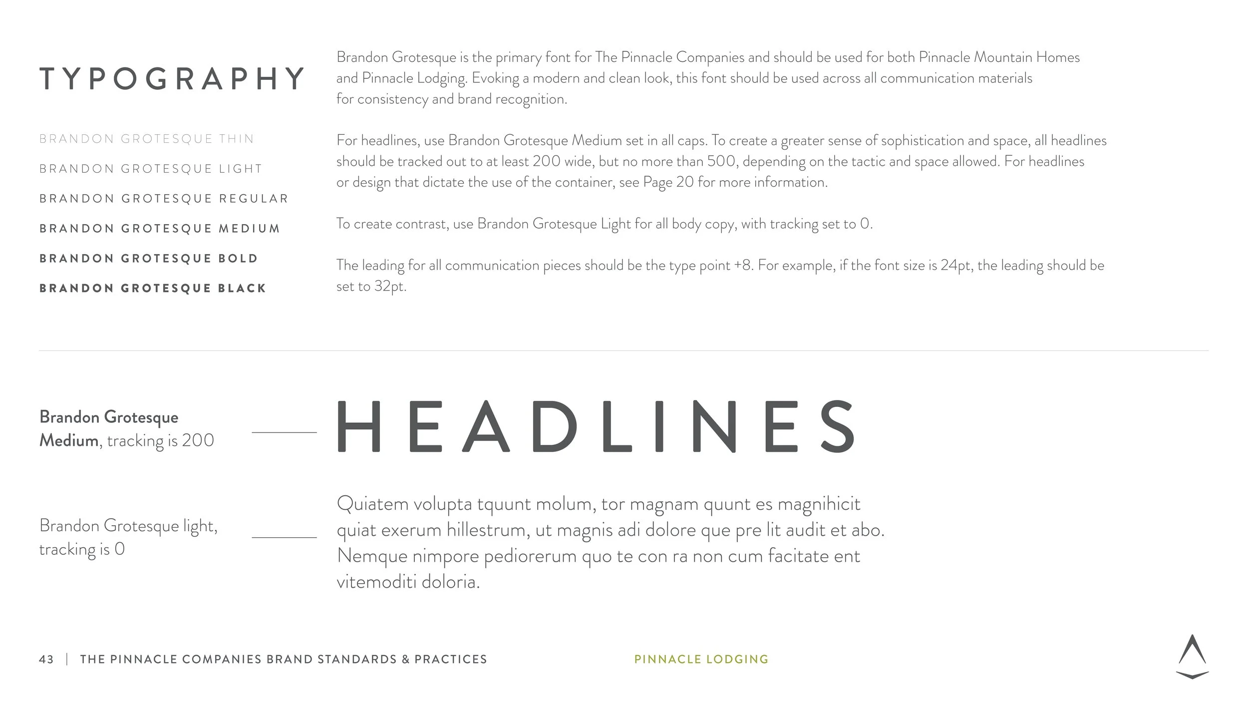
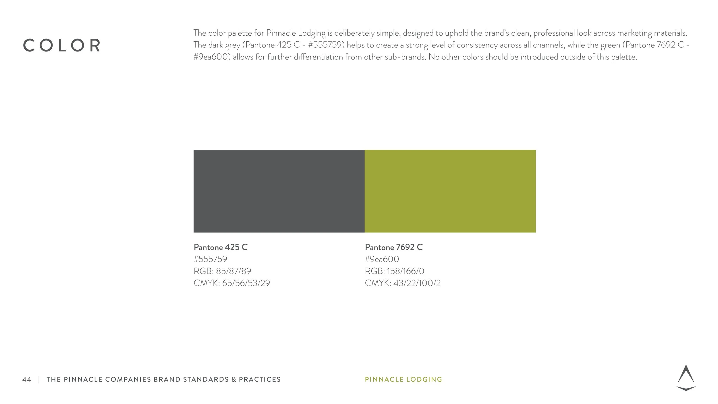
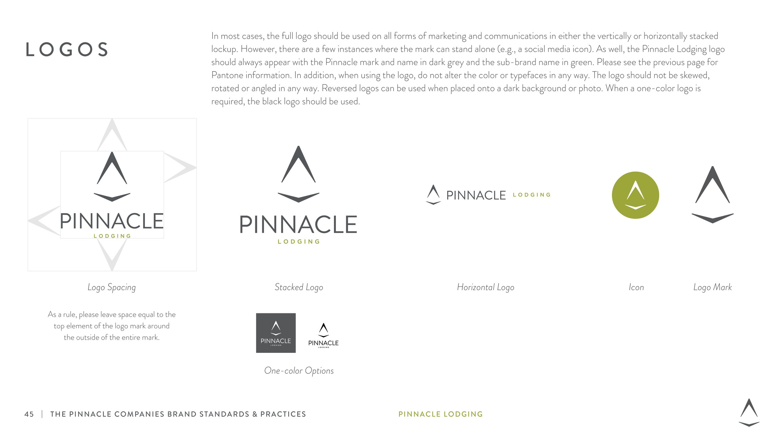
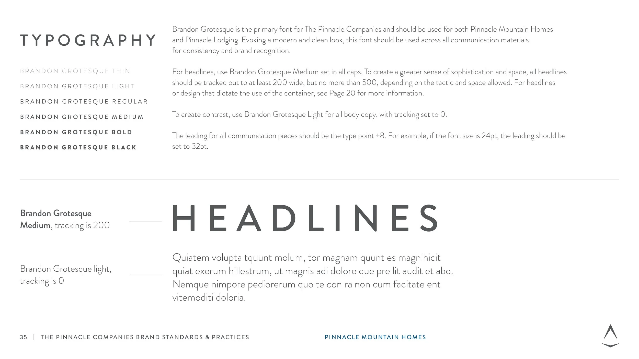
Unified Guidelines: Set concrete typography standards and asset structures to align all companies
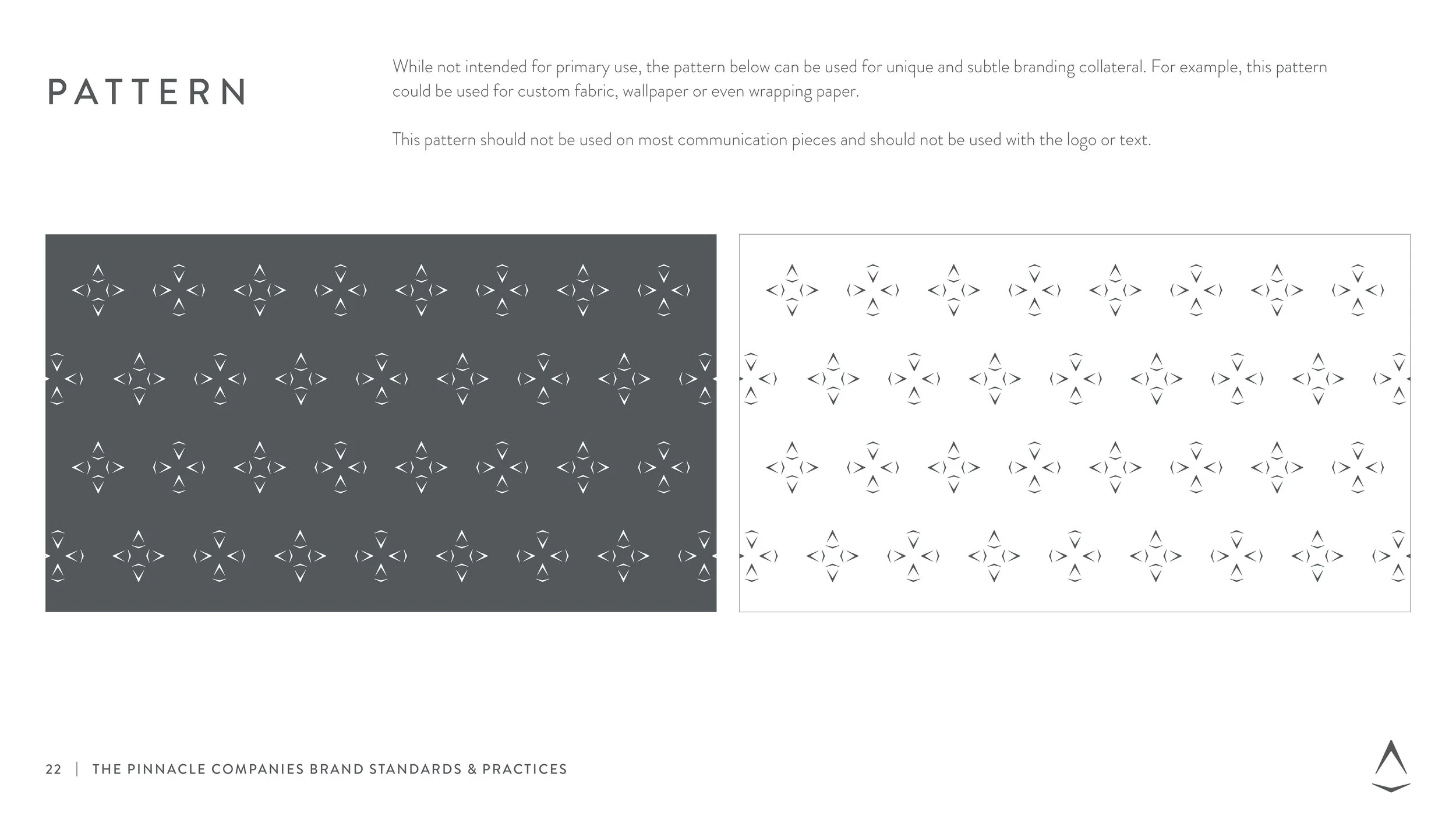
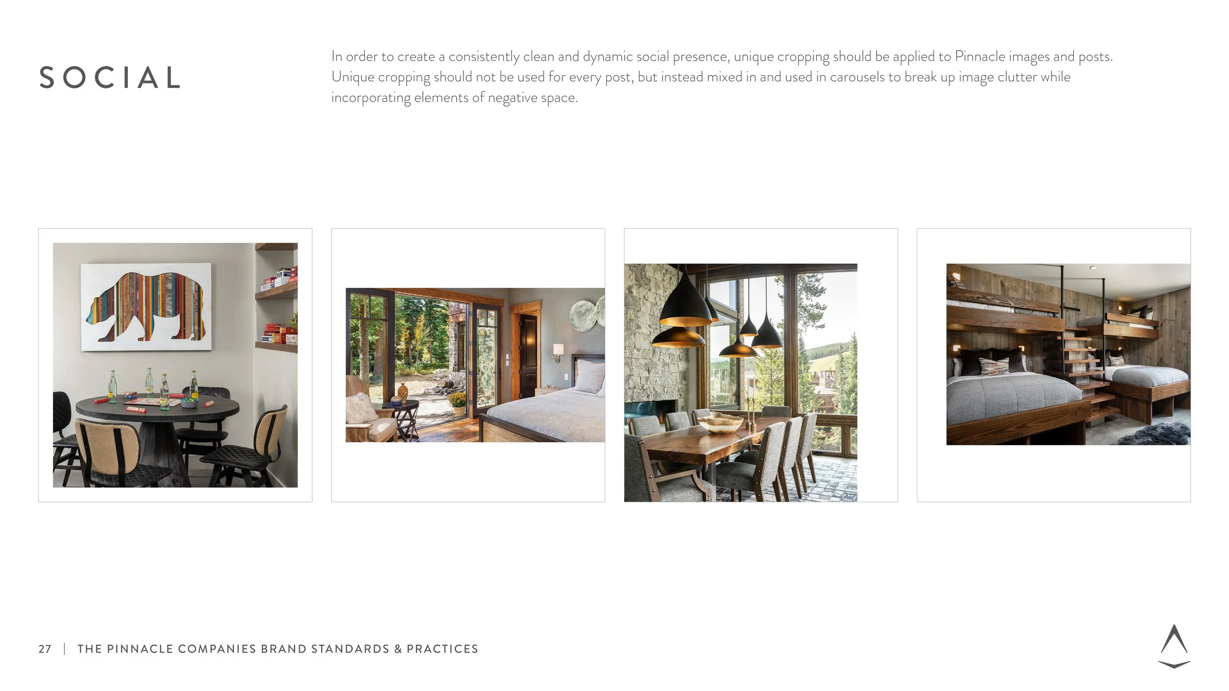
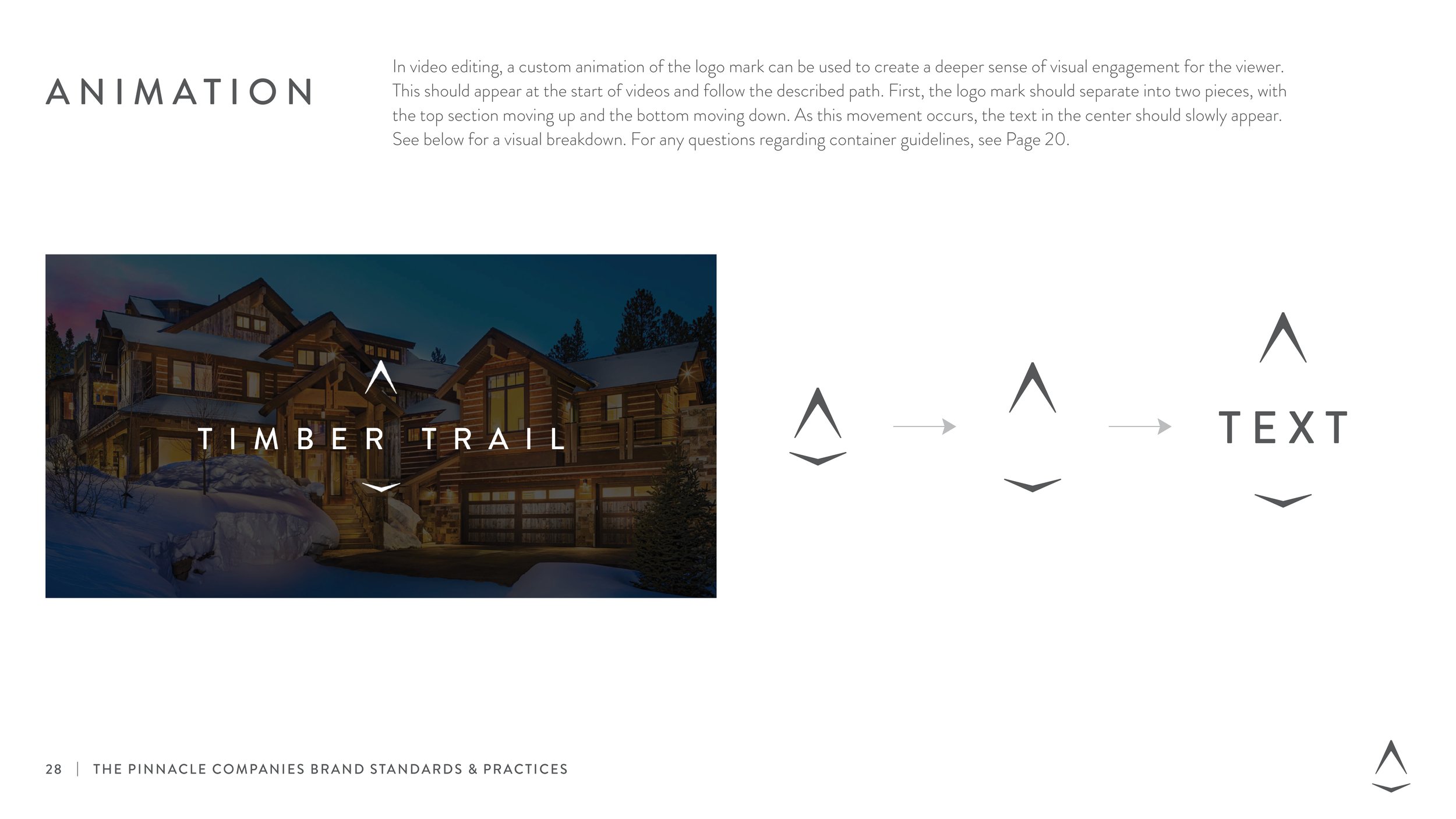
Tactical Applications: Developed specialized, real-world touch points to bring the design system to life, including pattern designs, animated elements, and social media templates.
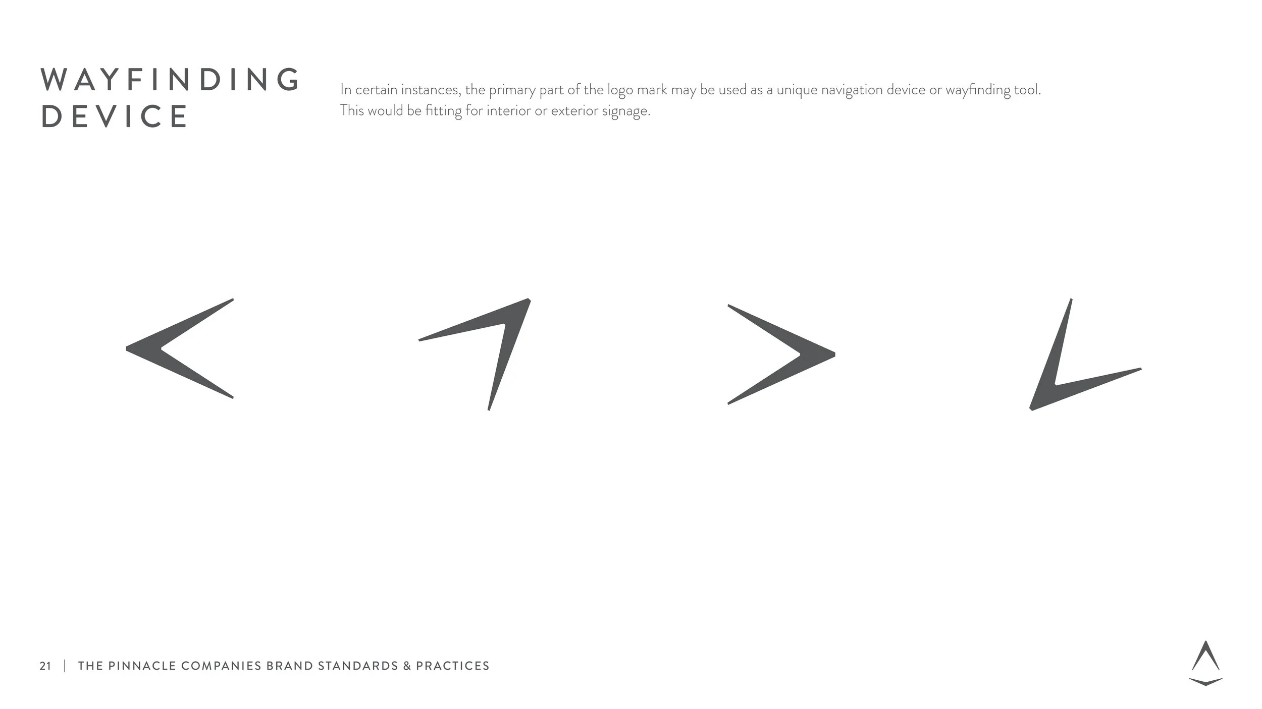
Environmental Wayfinding: Expanded the visual toolkit to include functional wayfinding tools, mapping out how the logo and container system interact dynamically with physical spaces.