Ripon College 175th Anniversary
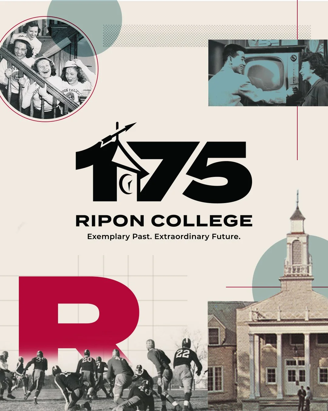
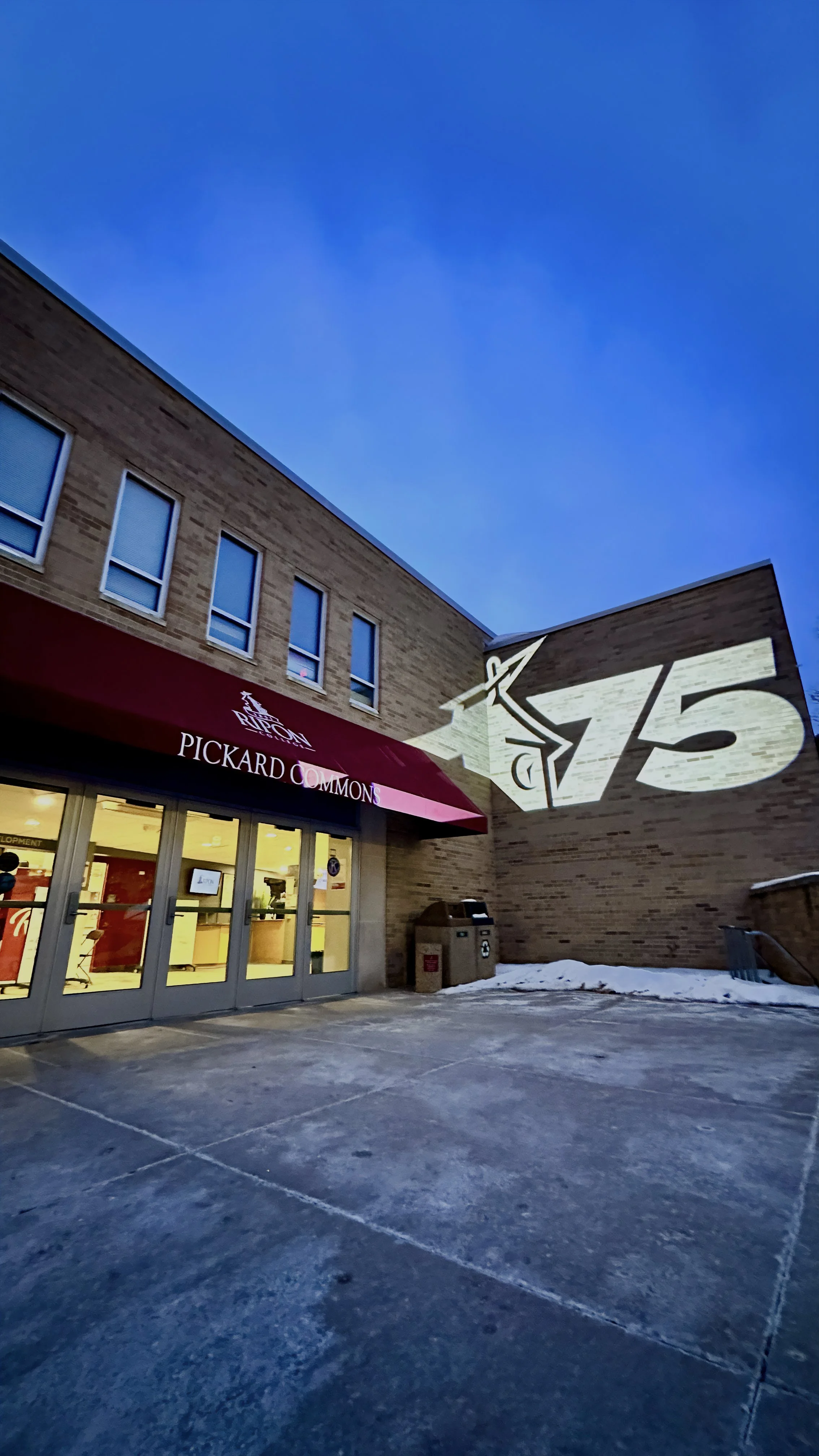
The Catalyst: Marking 175 years of academic excellence is a monumental milestone. To honor this historic moment, Ripon College required a comprehensive commemorative visual identity system. The creative challenge was multifaceted: the new logo needed to seamlessly align with the core institution's master brand while establishing its own unique, celebratory voice. Furthermore, it had to scale seamlessly across digital and physical touchpoints—from high-impact social media assets and website design to premium merchandise and print collateral—while resonating deeply with a diverse audience of alumni, current students, faculty, and board members.
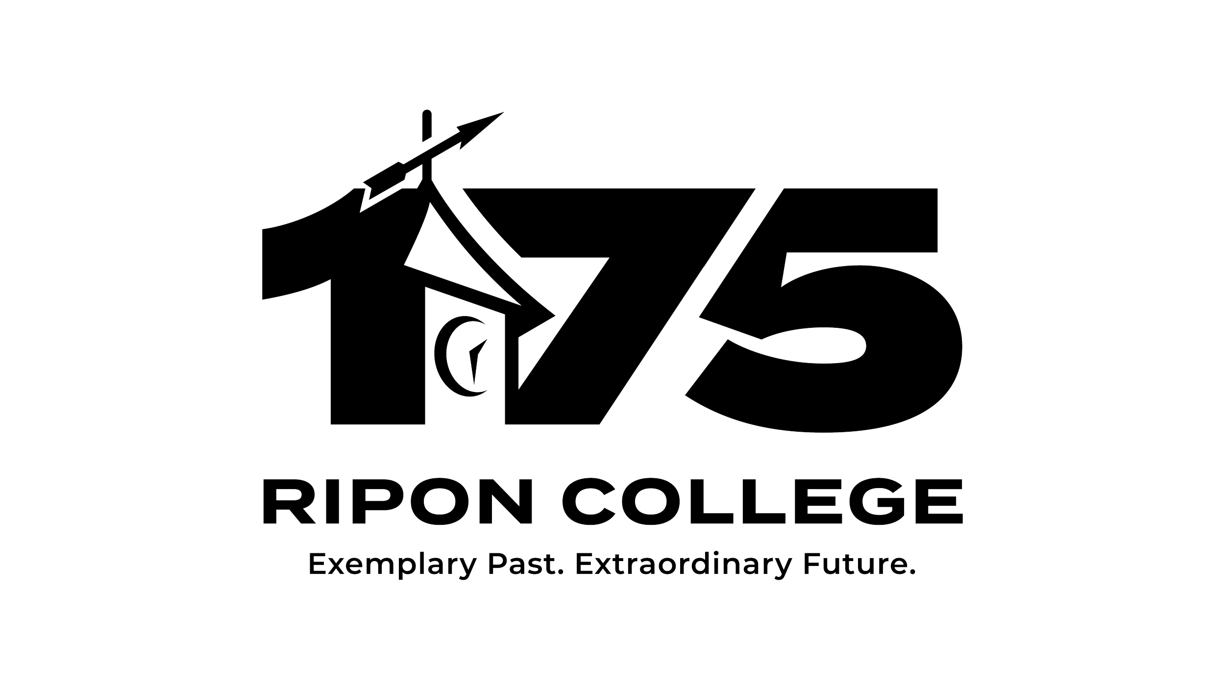
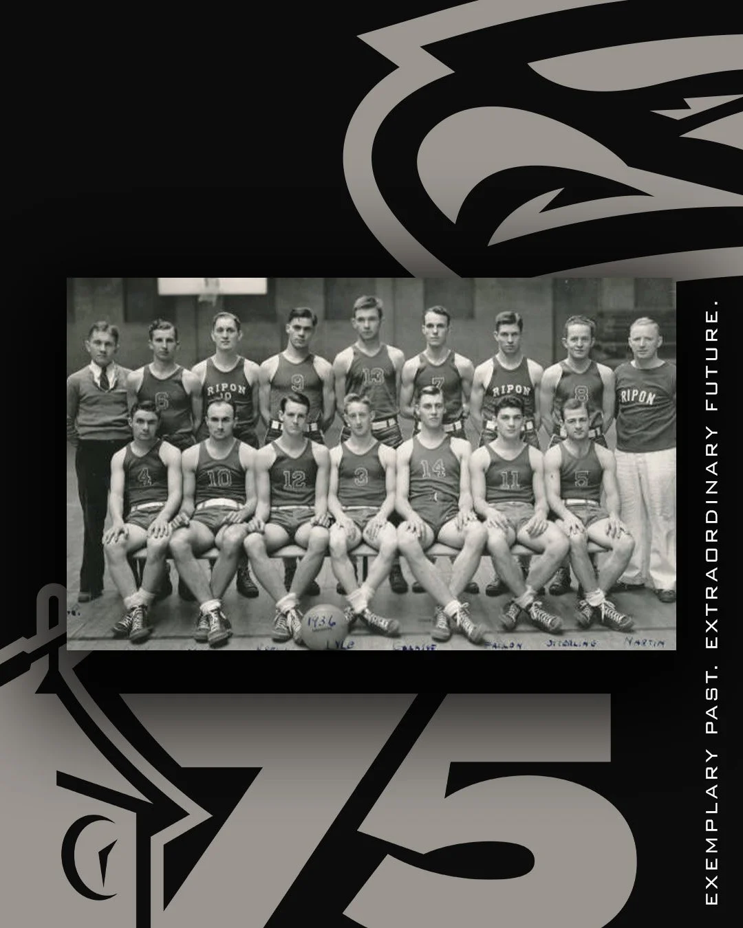
The Strategy: Merging Ripon’s iconic weather vane and clock tower silhouettes with a bold, stately serif typeface for the '175,' the mark reflects both historical prestige and a modern future. To support the logo, an editorial, modern scrapbook-inspired visual system was developed. This dynamic style allows for a fluid blend of vintage archive photography, contemporary imagery, linework, and abstract shapes—giving the university a deeply textured, flexible toolkit to tell its story across any creative tactic.
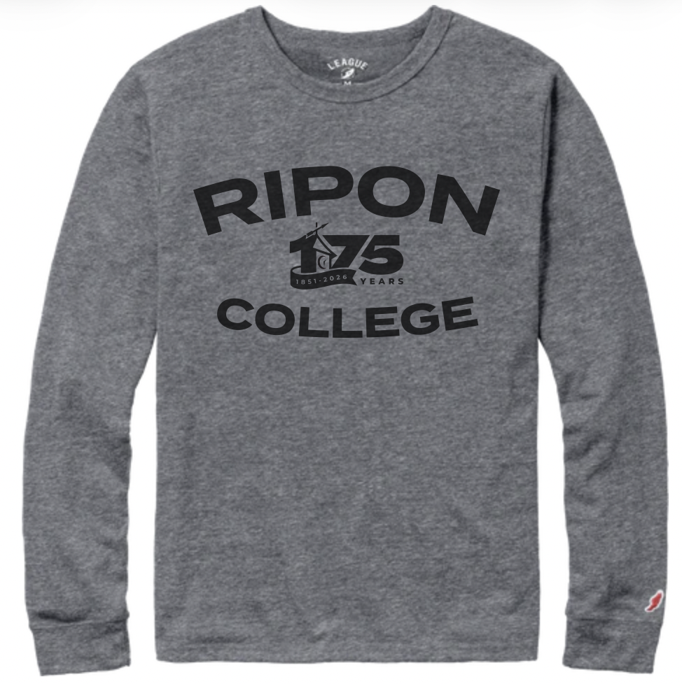

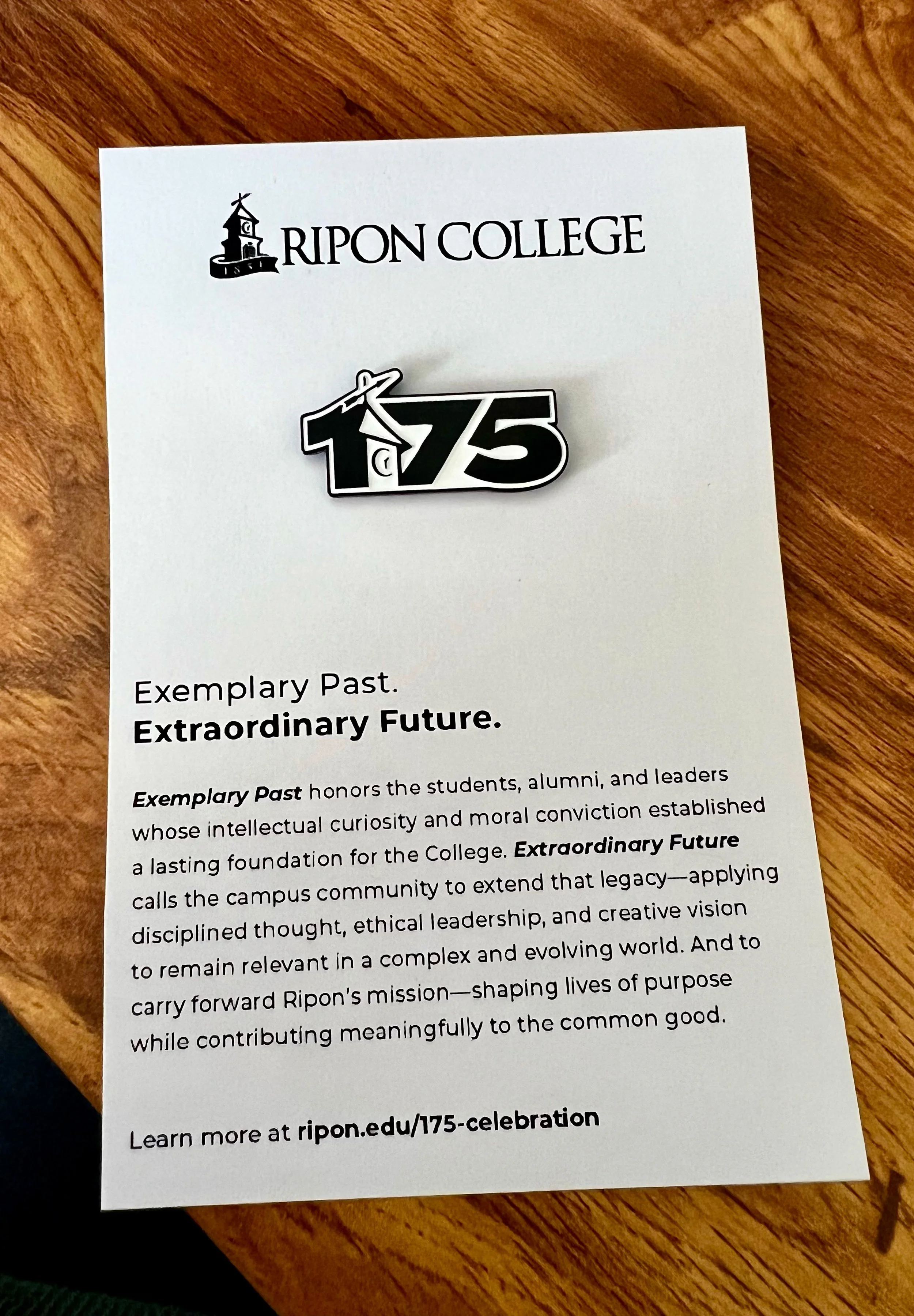
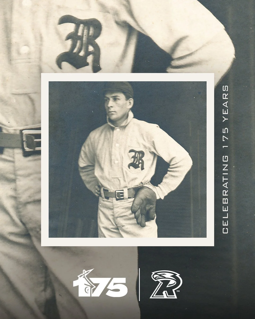
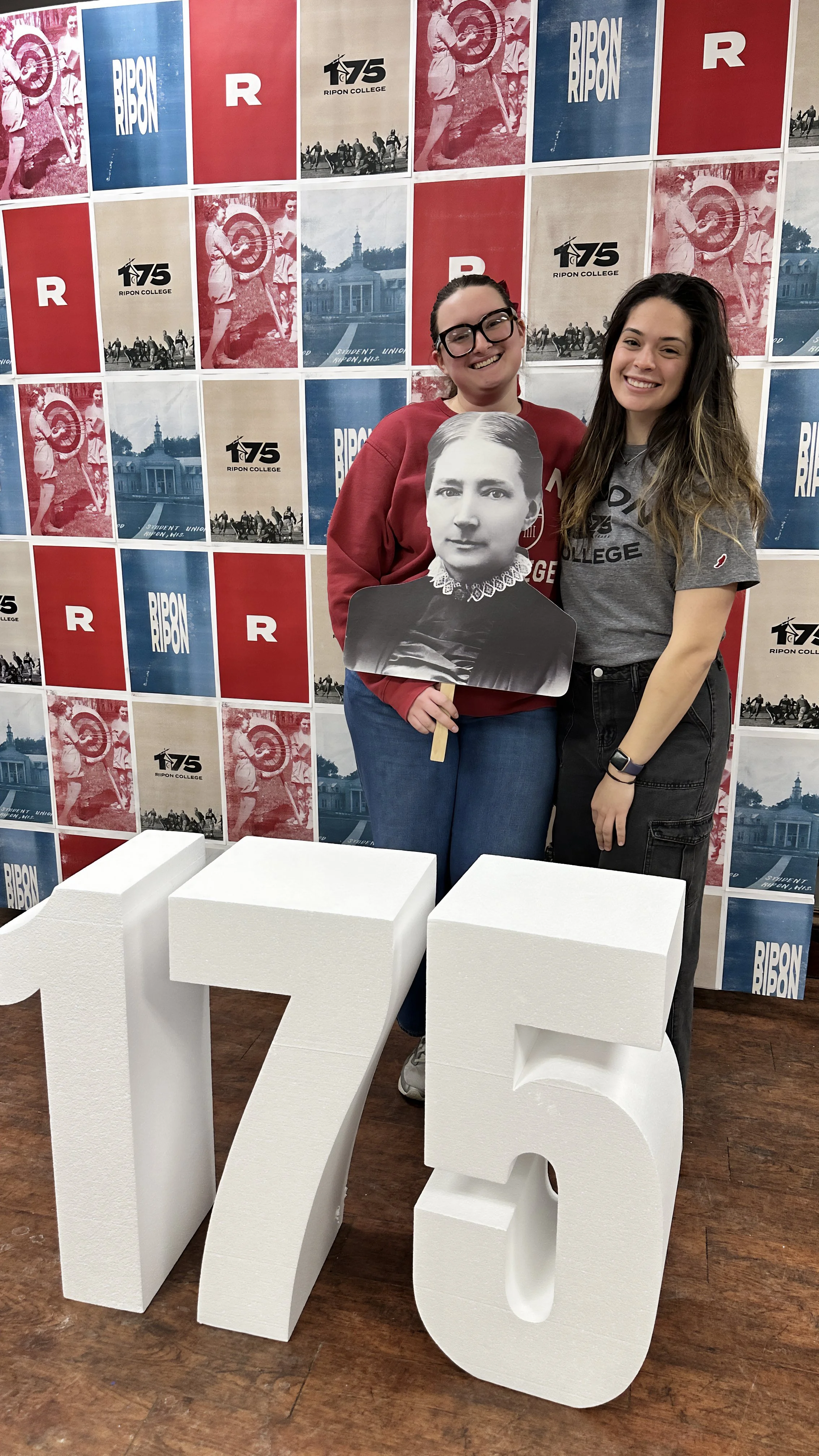
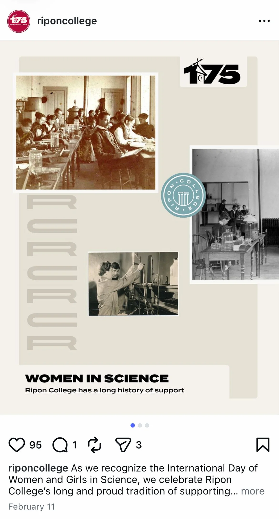
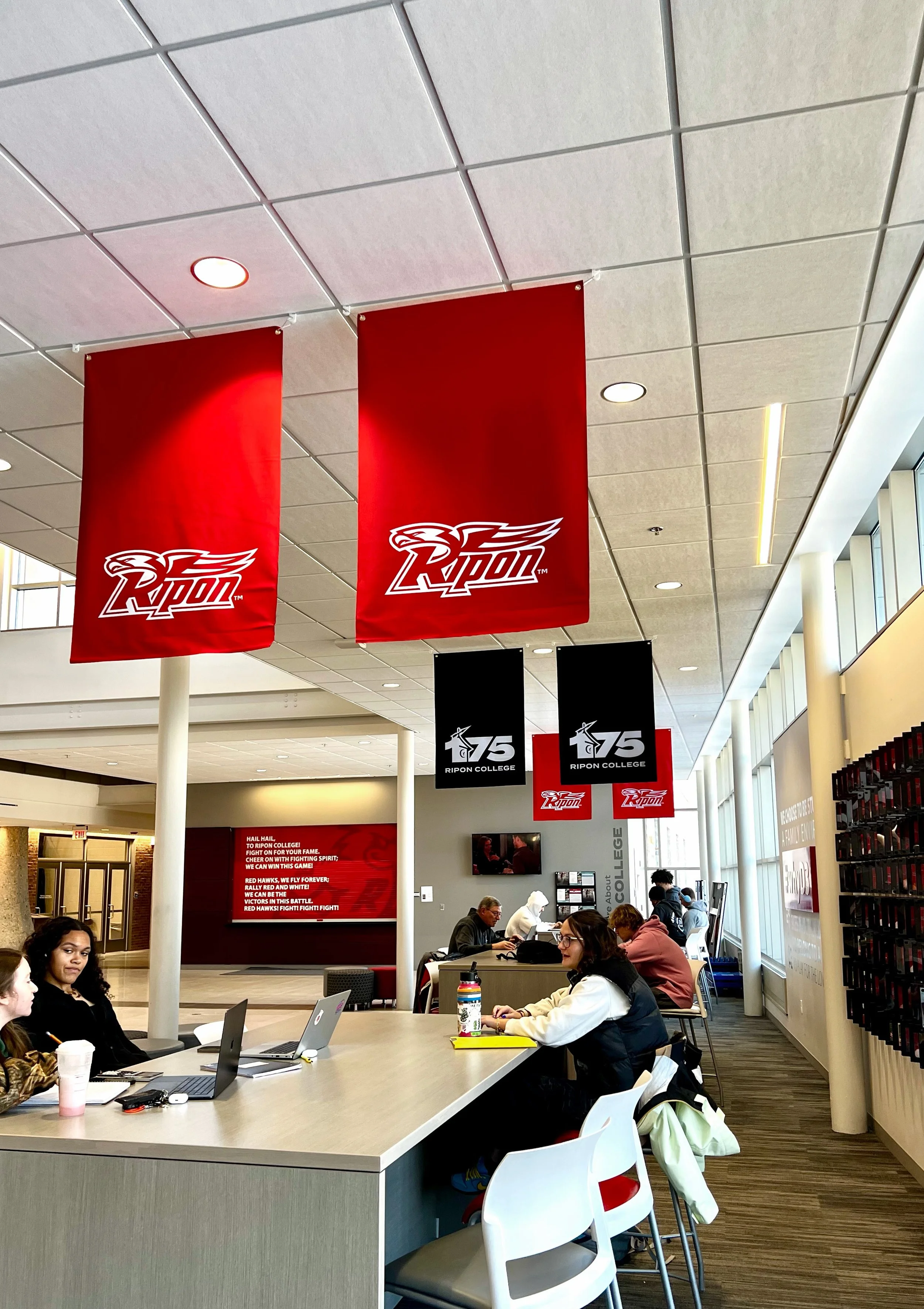
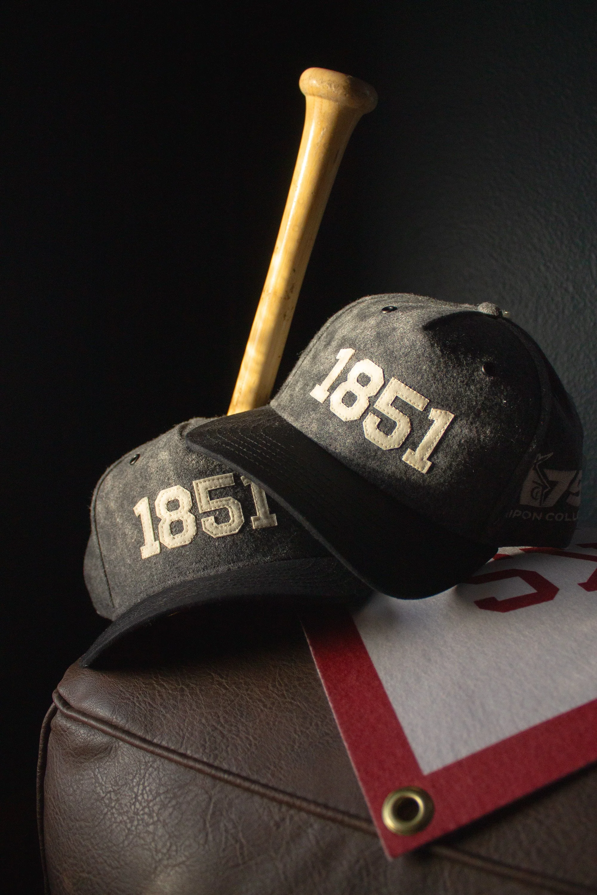
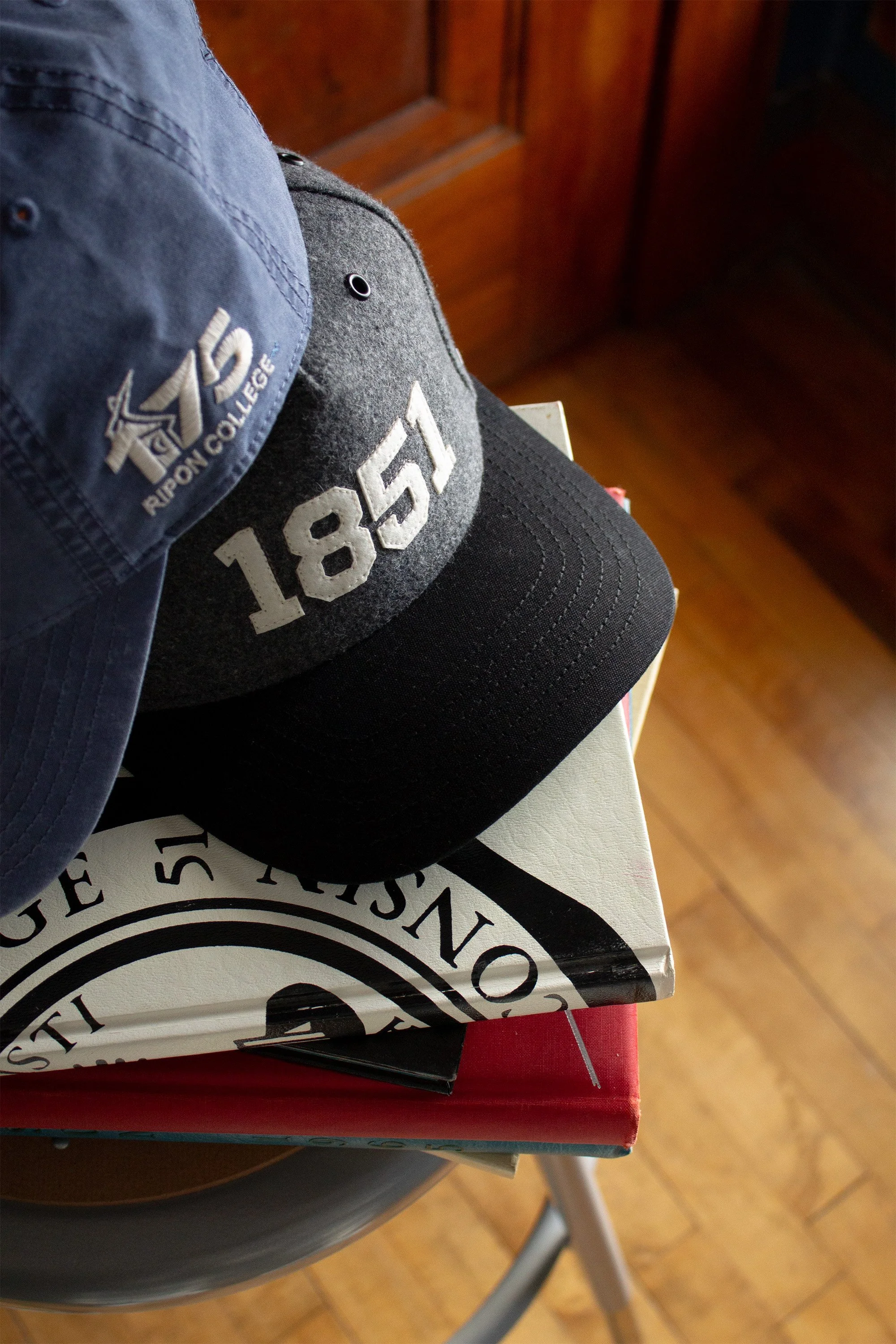
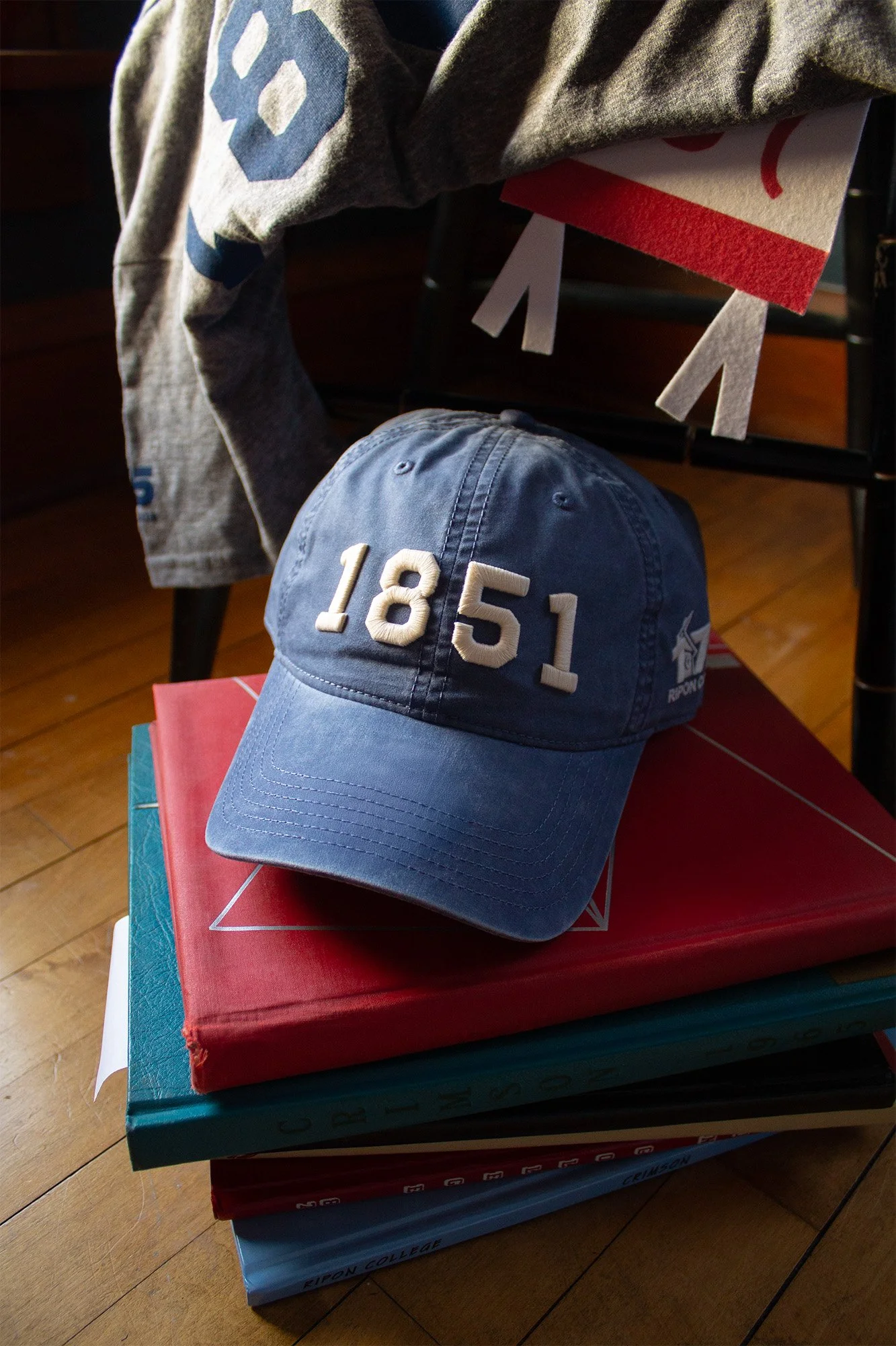
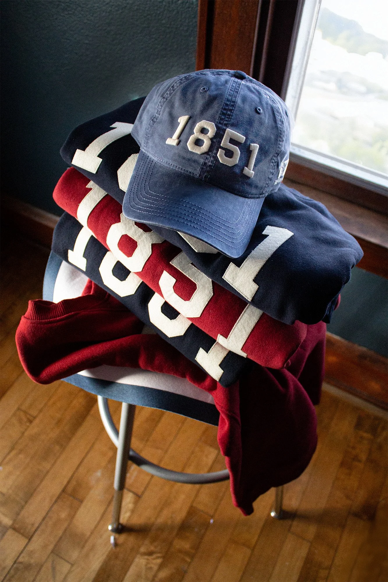
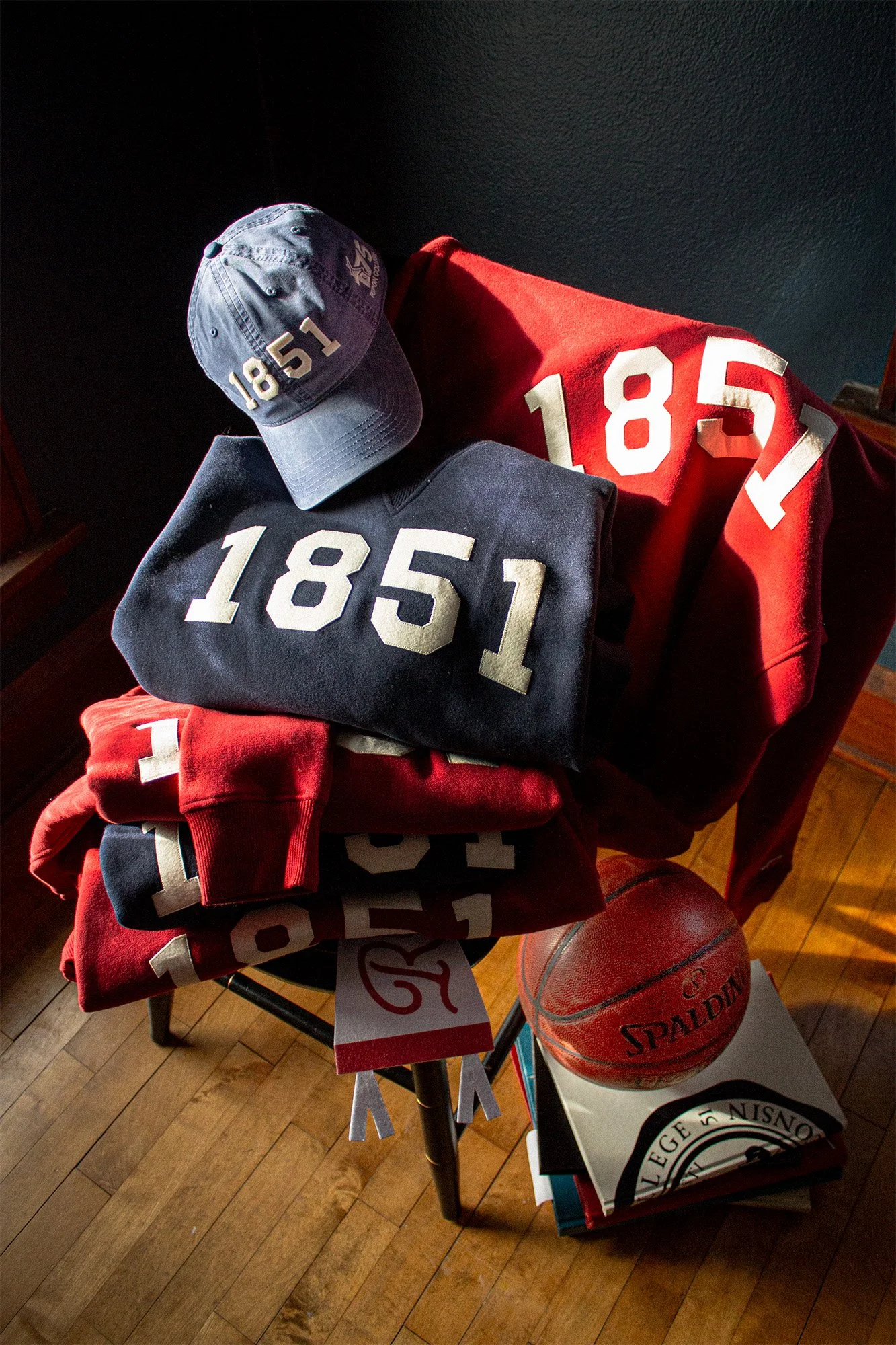
A milestone anniversary deserves a tangible keepsake. We designed The 1851 Collection, a curated apparel line celebrating Ripon’s founding year. To elevate the merchandise above standard campus gear, the focus was on selecting premium heavyweight fabrics, custom stitching methods, and high-density embroidery. Complemented by a crisp, timeless vintage typeface, the collection offered a sophisticated aesthetic that resonated with both students and alumni. The limited line was rolled out for a year-long physical retail activation across both campus apparel stores.
The 1851 Collection